My internship at the start-up company Junico was my first work experience as a designer. Junico is a platform for young freelancers. During this time, I gained valuable experience and worked on many projects. The company carried out an extensive rebranding at the beginning of my internship, which is why I was able to contribute to the creation of a design system. I realised how important a good design system is for a product and that a design system is an elementary component for the whole team. This experience helped me to focus on design systems in my bachelor's thesis.
I also regularly carried out user testings for the new design of the website where I also had to leave my comfort zone. During my internship, I also taught myself how to do simple animations and used these skills to produce advertisment videos for Instagram.
ROLE
UI/UX-Design
User Testing
TIME
Winter Semester 2022/23
TEAM
Junico
Video Presentation
Redesign
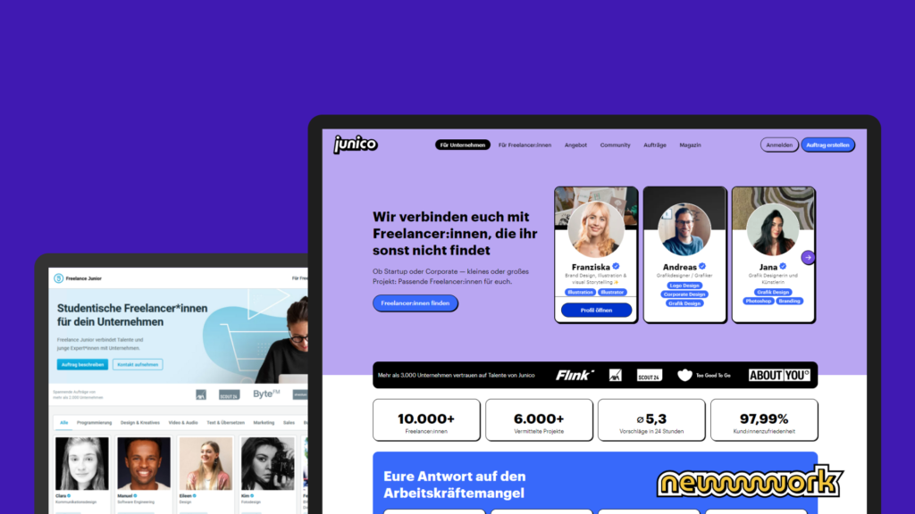
The brand underwent a thorough rebranding right at the start of my internship. Previously, “Junico” was known as “Freelance Junior”, as the focus was explicitly on juniors. However, as the platform is no longer mainly used by juniors, the name was changed to reduce confusion. Unfortunately, I was not involved in the process of finding the name, but I was involved in the process of redesigning the site. Which is where a lot has happened!
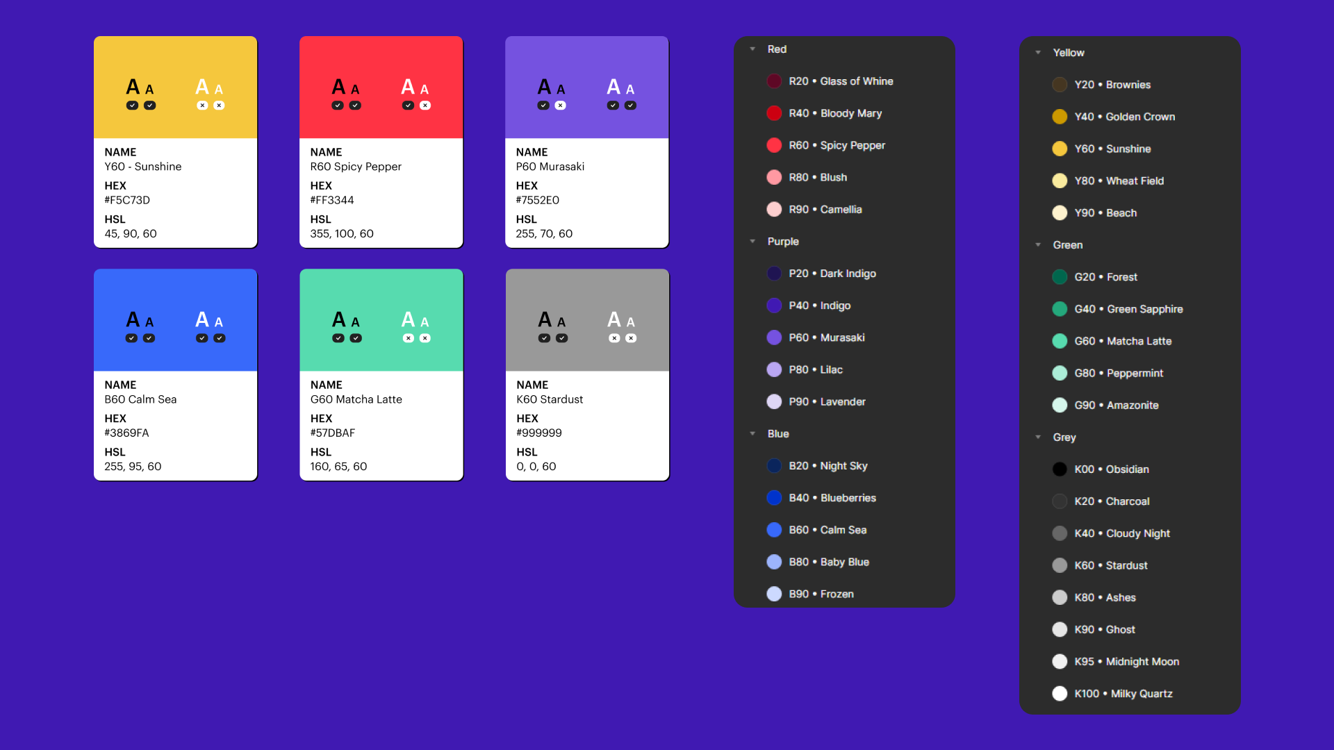
Previously, the design was quite simple and the color palette consisted mainly of soft shades of blue. To achieve a modern, fresh look, we deliberately chose a bright, high-contrast color palette. I adjusted the color values in detail and gave each color its own name. I also checked the contrast values with regard to accessibility.
Design System
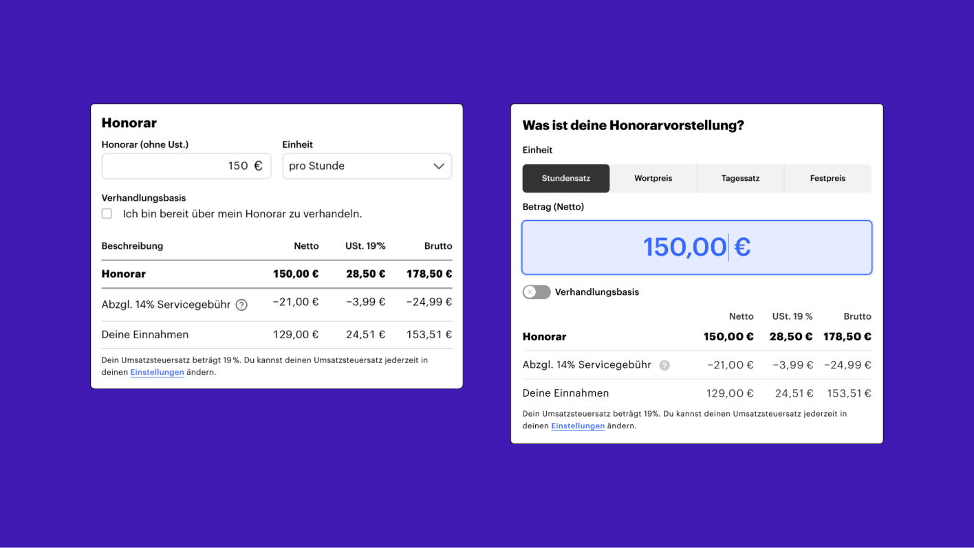
We started from scratch and created a new design system. There were a few issues since the previous design system had grown organically over time, sometimes using provisional solutions. This resulted in some inconsistencies and chaos. As preparation, I read the book “Design Systems” by Alla Kholmatova. For the design system, I concentrated on the buttons and the form input. In the first step, I collected screenshots of all existing states. I then recreated them in Figma and adapted them to the new design. The update to Figma’s properties came in very handy here, as I was able to quickly create all the states with just one component. I also made sure that the components were responsive so that I could save time during the design process. With these new components, I also had the opportunity to redesign and optimize larger interface elements. For example, I took on the interface where the freelancer enters their own fee expectations.
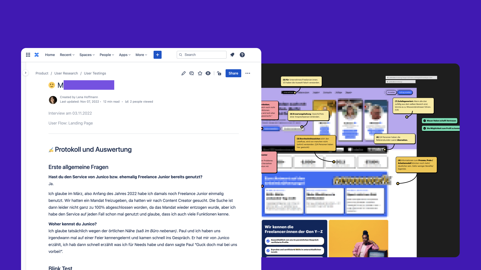
User Research
User research with user testings were also exciting. After our rebranding, we invited some users to take part in a user test. We started by testing the landing page and later evaluated the user flow during order creation. Beforehand, I wrote a questionnaire for each test. The interviews lasted a maximum of 20 minutes and consisted of individual questions, a “blink test” and a use case. I worked with hypotheses that we assumed at the design stage and that needed to be verified. The user testing sessions were recorded with prior permission so that I could concentrate fully on the interview and create detailed documentation at the same time. I was also able to look at the body language and facial expressions afterwards. Once there were enough interviews, I was able to systematically evaluate them and we were able to make several targeted changes to the design or text content.
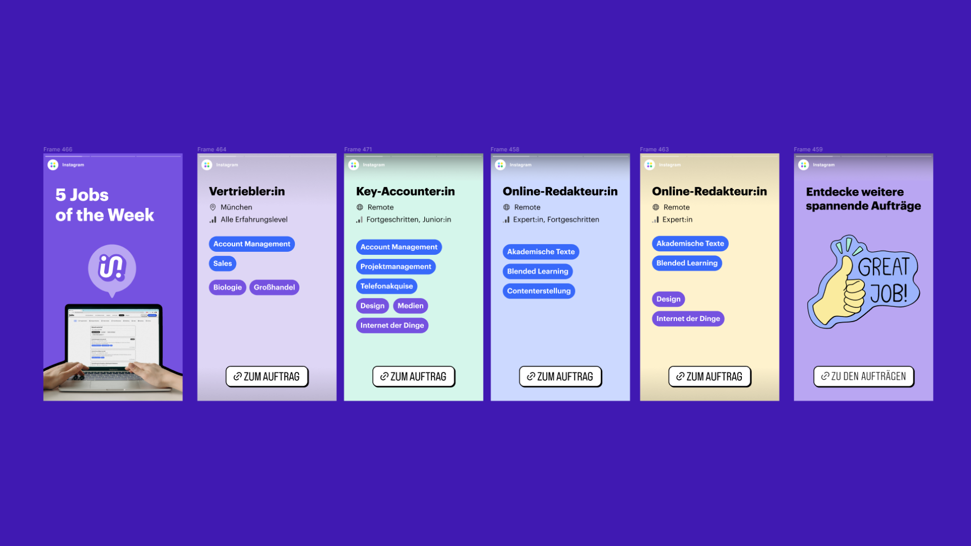
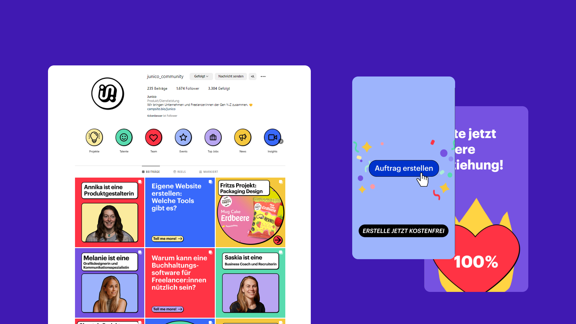
Social Media Design
The social media channels also needed a new look. Together with the marketing team, we introduced new formats and redesigned old ones. I created templates for the posting and story formats at Figma, which were then filled in by someone from the marketing team. I took over the posting on the channel for two weeks. I also created two advertising videos for Instagram.
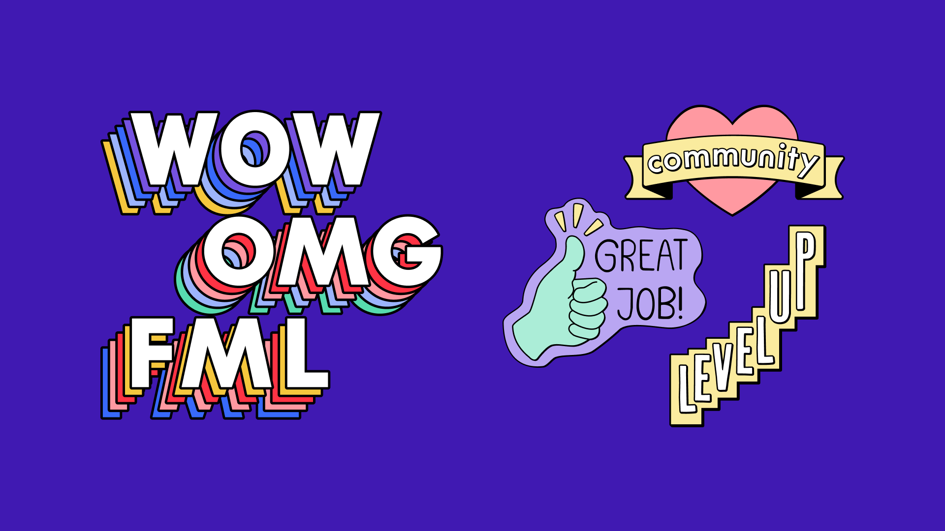
Emotional Design and Sticker Set
Stickers were added as decorative and illustrative elements, for whose creation I was responsible. Two different sticker sets were the result. I wanted to make sure that the design remained consistent so that you could tell that the individual stickers belonged together, despite the fact that I used different fonts. That’s why I defined the specifications for the colors, line thickness, distance of the drop shadow, etc. in the style guide and design system.